Over the past year, we’ve significantly improved the Torizon Cloud interface based on your feedback. To avoid disrupting workflows, we kept the previous interface online as Classic App while the new interface—New App—matured.
We’re preparing to retire Classic App (no earlier than December 31st, 2025), and we want to make sure New App covers your real‑world use cases. If you still rely on Classic, please tell us:
What tasks do you still do in Classic, and why?
What’s missing or harder in New App than in Classic?
We won’t decommission Classic until critical gaps are addressed and we’ve shared a timeline. Thank you for helping us make New App great for your workflows.
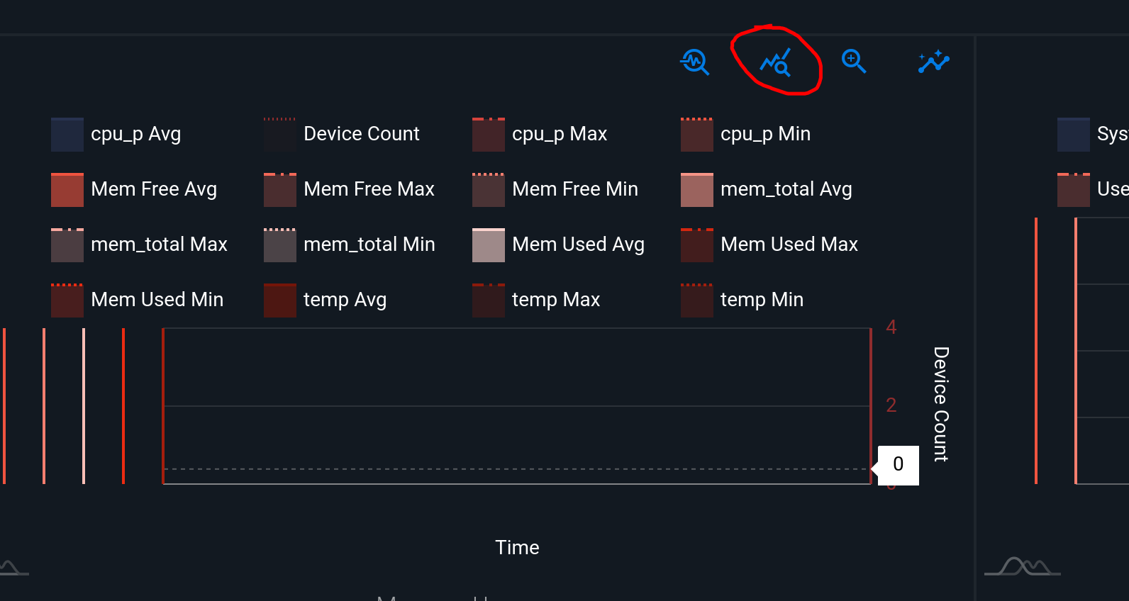
In the fleet management metrics graphs, there is a button to view all graphs in the fleet for a specific metric. This doesn’t seem to be there for the new app.
In general, the classic graphs are easier to read and select time frames. The new app is not clear on the graphs.
It also takes more button clicks for most operations in the new app. The classic is much more streamlined.
As a feature request, it would be great to have a ‘next’ device button, so can easily scroll through devices when checking operation/metrics etc.
Yes that is the button that is available in the Classic App, but not the new app. Gives the ability to see all the graphs for a fleet for a particular metric at once. This really helps to find issues with specific units. The outlier feature often doesn’t work as easily as to just scan all the graphs.
We need the app to be useful and easy to use, not fancy UX.